Search this blog

31 May 2010

S is for Style

This is my inchie for letter S of the Inchy by Inch Alphabet challenge.


The image is from Art Creations Friday & the words are torn from an old English Dictionary.


The image was printed on white card & adhered to a mountboard base. The edges were sanded. The dictionary words were inked with Distress Ink (antique linen) & then added to the inchie.

To see a slideshow of this set, please click here.

28 May 2010

A Stroll in the Sun

My project this week has been to work on a blank canvas (5 x 6¾ inches). As with most blank canvases, it was rather daunting, but taking inspiration from Tim Holtz blog theme this week of Distress, I took two plain white Prima paper flowers & let my creativity flow ...


To distress the flowers, I used Adirondack Acrylic Paint Dabbers (Sandal, Hazelnut & Lettuce). I added an old button to the centre of each flower, using gold metallic thread, then stitched along the petals. A few touches of gold from my Marvy Metallics pen & Gold Stickles to finish.

So on to the canvas. I began with a rectangle of Hazelnut paint. Once dried, I brushed a little Heirloom Gold Perfect Pearls, then I added Lettuce, edging it with Gold Stickles.


The centre motif uses handmade cream paper, cream jute ribbon, a square of white mountboard coated in Distress crackle paint (antique linen) with a button with gold metallic thread in the middle.


The Flora Doodles velvet butterfly was distressed with Distress Ink (brushed corduroy). I added lime green gems to the wings & Stickles. I removed the original black antenna & replaced them with my own hand coiled gold wire ones.

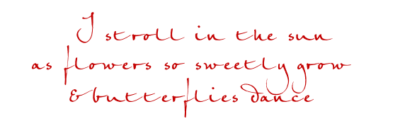
I composed a Haiku (a Japanese poem) to tie the canvas elements together. The words were printed on white copy paper. Each word was torn out to create the frayed edges, then they were inked with brushed corduroy Distress Ink. The words were adhered to the canvas using Glossy Accents.


25 May 2010

The Language of Flowers

One of my favourite paper ranges is Brianna
designed by Brenda Walton for K & Company,
so I loved making this pair of altered matchboxes.


The first box uses the flower definitions on one of the papers as it's inspiration.


I added a glazed flower with words to the top of the cover.

Inside, I covered the printed butterfly & flower with Glossy Accents,
added green ribbon & a paper punched heart shape.

I added an extra heart to the bottom of the cover.


The second focuses on the simplistic beauty of the floral paper.


I tied green ribbon around the cover.

Inside, I added a glazed flower & butterfly cut out from the paper
& mounted with 3d foam.

I covered the green ribbon pattern with Glossy Accents
& added a few words.


The drawer handles are Hitch Fasteners by Tim Holtz.


24 May 2010

R is for Ribbon

This is my inchie for letter R of the Inchy by Inch Alphabet challenge.


The image is from Outsider Artists & the words are torn from an old English Dictionary.


The image was printed on white card & adhered to a mountboard base. The edges were sanded. The dictionary words were inked with Distress Ink (antique linen) & then added to the inchie.

To see a slideshow of this set, please click here.

21 May 2010

The Gardener's Friends

I've caught the matchbox bug!

The theme for this pair is The Gardener's Friends, the bee & the ladybird.


Using Life's Journey Pansy paper by K & Company, I covered two blank matchboxes.


I added small pearls, ribbon, flowers made using a paper punch, metal charms & a touch of Glossy Accents.


This matchbox uses letters cut from the paper, to spell out the words.


I used dictionary definitions for this box, torn & inked with antique linen Distress Ink.


I used Hitch Fasteners by Tim Holtz as drawer pulls as they are the perfect size.

I feel a new addiction coming on ...


20 May 2010

Birds, Cats & Dogs

This project was to make a matching pair of altered matchboxes.


. I used Brenda Walton's Maison paper,
elements from K & Company,
& metal animal charms.


The boxes were covered in the patterned paper.

For the drawer pulls, I used Hitch Fasteners by Tim Holtz
& miniature tassels, as a decorative feature.


I added definitions torn from an old English dictionary,
aged with Distress Ink (brushed corduroy).


I added brown ric-rac ribbon & two metal charms inside each box.


My thanks to
Brenda - such inspiring papers
Tim - Distress Ink & Hitch Fasteners


17 May 2010

Q is for Quality

This is my inchie for letter Q of the Inchy by Inch Alphabet challenge.


The image is from Art Creations Friday & the words are torn from an old English Dictionary.


The image was printed on white card & adhered to a mountboard base. The edges were sanded. The dictionary words were inked with Distress Ink (antique linen) & then added to the inchie.

To see a slideshow of this set, please click here.

10 May 2010

P is for Paper

This is my inchie for letter P of the Inchy by Inch Alphabet challenge.


The image is from Art Creations Friday & the words are torn from an old English Dictionary.


The image was printed on white card & adhered to a mountboard base. The edges were sanded. The dictionary words were inked with Distress Ink (antique linen) & then added to the inchie.

To see a slideshow of this set, please click here.

03 May 2010

O is for Ornament

This is my inchie for letter O of the Inchy by Inch Alphabet challenge.


The image is from Hot off the Press & the words are torn from an old English Dictionary.


The image was printed on white card & adhered to a mountboard base. The edges were sanded. The dictionary words were inked with Distress Ink (antique linen) & then added to the inchie.

To see a slideshow of this set, please click here.