Search this blog

Showing posts with label Altered Art. Show all posts

20 April 2019

Swimming against the Tide

This small project was inspired by Kasia Avery's
Wanderlust Class on the theme of
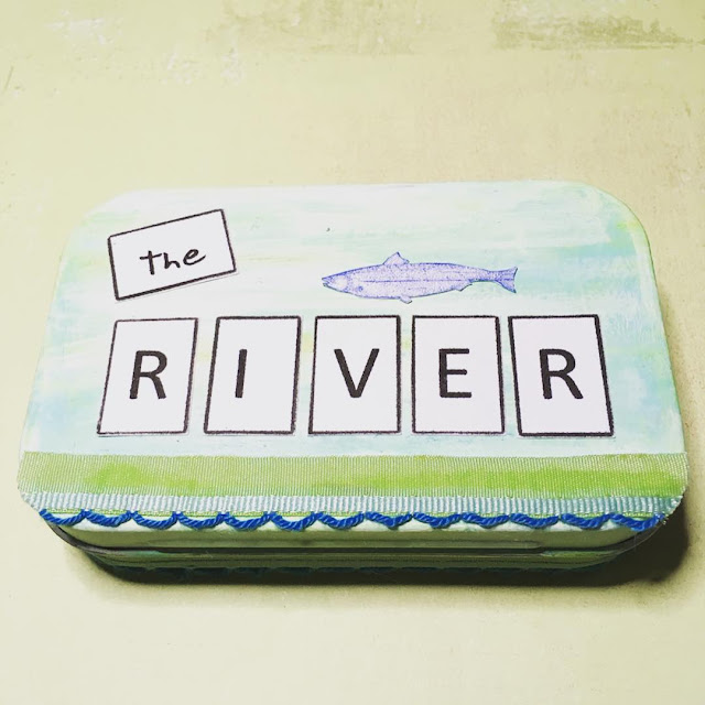
Rivers.


Her lesson was a fold out insert in her journal,
but mine uses an old mint tin.
I decorated the tin,
inside and out,
& made my fold out insert.


She encouraged us to take our time,
to make use of old forgotten products,
so my product list is a long one.


I used the following Ranger products.
Glossy Accents,
Texture Paste,
Dina Wakley Glazing Medium,
Tim Holtz Distress Inks
(crushed corduroy, broken china
& peeled paint),
Tim Holtz Distress Crayons
(mustard seed & twisted citron).


Faber Castell Gelatos (Snow Cone)
& watercolour pencils.


DecoArt Americana Clear Chalkboard Coating.

Daler-Rowney Gesso Primer in white.


eco crafts Acrylic Paints
(Waterfall & Tidepool).


Dew drops by Robins Nest
& Glass beads.


Pale blue ribbon,
green & blue textured ribbon
& mulberry paper.


Images from The Graphics Fairy
& printed text.


22 June 2012

Stuck for ideas

I was hoping to go to a craft class today, but as the world was conspiring against me, yet again, I was at home twiddling my thumbs.

Now sometimes I know actually what I want to do, then there are the times when I am completely stuck for ideas. So this week I turned to my blogging friend Jo for inspiration & seeing as I loved her stuck stick project, I turned this into my very own "class".

Here are mine ... container yet to be found.


Coffee stirrer sticks from you-know-where, coloured with Tim Holtz Distress Inks & stamped with Archival Ink (Sepia & Jet Black).

So the next time that my creative muse decides to wander off, I can pick a stick & use it to inspire me.

Thanks Jo :o)

03 June 2012

In the Shadows

This is an altered business card box, using an image from Mary Green at Green Paper.


I delved into my beloved paper stash & found some Urban Couture paper by Basic Grey. I love the blend of colours & the quality of the paper.


The outside of the box is covered in Mila.


Inside I used a little Tweed paper alongside the Tim Holtz distressables 8x8 Bingo paper.


For the small chest, I covered half a matchbox with Mila & used a button as the drawer pull.

06 August 2010

In the Frame

This week's project was to alter an old frame. This one, probably over ten years old, was a gift from a friend from their trip to Disneyland. Let's just say it was Eeyore & purple ... I think that's enough to give you an idea of what it was like!

It is four inches square with a photograph aperture 2 inch square, so it was perfect to house my Steampunk Twinchie.


I removed the glass & covered the frame, front & back, with papers designed by Brenda Walton from K & Company.

I used one of the hinges from the back to act as a tab to hold the twinchie in it's place.

I printed two copies of the moth (used in the twinchie) to create the dimensional moth, adding wire antenna.


The words are torn from one of the patterned papers with two epoxy stickers from the same kit.


I added a clock face from my hardware stash.


As with most of my projects, I like the reverse to look as good as the front.


And the sides!


I used double-sided tape, Glossy accents & a little Distress Ink (walnut stain).


15 April 2010

Altered Slide Mailer

Taking inspiration from Leandra Franich at Paper Artsy,
my project today was to alter a slide mailer.

The mailer was cut in half & covered with Brenda Walton's Maison paper
from K & Company.

In addition to the papers, I also used Maison stickers
& Tim Holtz mini grungeboard elements (keyholes, hinges & heart shape)
& his "home" definition Epoxy Stickerz from Junkitz.


I sanded the edges of the mailer then used Distress Ink (brushed corduroy)
to add age & distress to the mailer.

The keyholes & hinges were coloured with the same Distress Ink
& heat embossed with Distress embossing powder (black soot)
to give a rusty hammered metal appearance.


I used my Crop-a-dile to cut through the thick cardboard to create a keyhole
you can see through & placed a keyhole on each side.


The long paper sticker "Home is where the heart is"
was stuck to a strip of mountboard then each word was cut out
& the edges sanded.

I substituted the heart word with a grungeboard heart, covered in paper.

A small pearl was attached to the centre of the flower.


The large metal key is Life's Journey Metal Art by K & Company.

The paper button sticker was covered with a Papermania clear dome sticker,
to give dimension & strength so that it would sit proud on the bottom corner.


To finish I attached the two hinges using Glossy Accents.


My thanks to

Brenda - love those papers
Tim - grungeboard, ink, distressing powder & epoxy sticker
Leandra - for her inspiration

10 March 2010

The Paris Project


This is a project that has kept me quiet for a few days.


I altered a blank mdf album into a keepsake of my many visits to Paris, France.


I covered the blank pages with paper & elements
from Brenda Walton's Maison collection by K & Company.

The pages are approx. 8½ inches tall & 3 inches wide (ignoring the tabs).


I looked through my photographs to choose my favourites
& scanned the selected ones onto my computer.

I then altered most of the coloured photographs to monochrome
& selected a brown tone.

I cropped them to fit into an image of a slide mount
(using an image of a brown weathered mount by Tim Holtz).


Once all the images were completed, I printed them out on A4 photographic paper,
cut each image out & sanded the edges.

Text was typed up on the computer, printed out
& secured under blank slide mounts.


I added a few of Tim's doo-dad words & tied the pages together
using some lovely red & cream polka dot grosgrain ribbon.


My thanks to
Brenda - love those papers
Linda - for the mdf album
Fifi - for the ribbon
Tim - slide mount, words & inspiration from the design of his new book,
A Compendium of Curiosities