Search this blog

29 March 2010

Easter Decoration

An altered cd made as an Easter decoration,
using paper & elements from Rhonna Farrer's Color my World digikit,
(from Two Peas in a Bucket)
& a bunny template from Inspire me!


After I finished my Easter design, the image was printed on white card.

The cd was covered both sides & edged with a Marvy Metallics gold pen.


I cut out three more bunnies,
sanded the edges to reveal the white cardstock underneath
& layered them using 3d foam.

I added a touch of gold Stickles for the eye & nose on the top layer.


I punched a hole through the top of the cd using a Crop-a-dile
& thread two pieces of brown polka dot organza ribbon through the hole
& tied with a knot.

L is for Lace

This is my inchie for letter L of the Inchy by Inch Alphabet challenge.


The image is from Outsider Artists & the words are torn from an old English Dictionary.


The image was printed on white card & adhered to a mountboard base. The edges were sanded. The dictionary words were inked with Distress Ink (antique linen) & then added to the inchie.

To see a slideshow of this set, please click here.

27 March 2010

Dragonfly Birthday Card

A birthday card using patterned papers by Hot off the Press & flower templates by Inspire me!


The flower has six layers with a brad through the centre. I sanded the edges of all the papers to give a shabby distressed look.


The silver coloured metal dragonfly was coloured with Adirondack Alcohol Inks (Eggplant & Wild Plum) then covered in Glossy Accents & sprinkled with Art Institute Glitter (85 Crystal Utrafine Transparent) & two glitter gems added for eyes.


For the finishing touch, I wrapped white organza ribbon around the card & tied a bow.


25 March 2010

Feathered Friends

The inchie challenge theme on the Small World of Inchies blog* is Birds of a Feather.


The inch squares were made using background images from The Graphics Fairy & images of the eggs & birds from The Vintage Moth. The images were digitally altered, printed on white card, then adhered to mountboard bases. The edges were then sanded.


The words were torn from an old English dictionary & aged by using Distress Ink (antique linen). A pair of pearls were added as the finishing touch.


* This challenge blog is no longer in existence.

24 March 2010

Chocolate Easter Bunny

An Easter card, using paper & elements from Rhonna Farrer's Color my World digikit, available at Two Peas in a Bucket & a bunny template from Inspire me!


Once I had finished my design, it was printed out on white card & trimmed to size. The edges of the card were sanded to remove some of the ink, revealing the white card underneath.


There are three layers to the bunny, mounted using 3d foam & gold organza ribbon wrapped around the card & tied in a bow.


I also used a little glitter from my gelly roll stardust pen by Sakura.


23 March 2010

Thanks

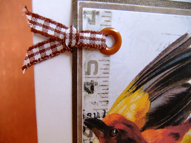
A Thank you card made using a digikit from Two Peas in a Bucket
by Vinnie Pearce called ATC Card Elements.


After printing out the digitally altered image on white card,
I sanded the edges then mounted on co-ordinating card & paper
by Hot Off the Press.

I added a large eyelet, using my Crop-a-dile
& brown gingham ribbon to match Vinnie's design.


For added interest, I added Glossy Accents to the bird's eye & the Thanks motif.


22 March 2010

K is for Knit

This is my inchie for letter K of the Inchy by Inch Alphabet challenge.


The image is from Crafty Computer Paper & the words are torn from an old English Dictionary.


The image was printed on white card & adhered to a mountboard base. The edges were sanded. The dictionary words were inked with Distress Ink (antique linen) & then added to the inchie.

To see a slideshow of this set, please click here.

19 March 2010

A Quick Thank you

A quick card made using a digikit from Two Peas in a Bucket by Vinnie Pearce called ATC Card Elements.


I adapted one of Vinnie's ATC card designs to create my square image, adding a "Thank you" note to the front by using part of another design from the same digikit. I copied part of the flower design to create a digital epoxy motif.


I used a corner rounder paper punch on the patterned papers & base card, to echo the curves of the flower petals & the epoxy motif.

I sanded the edges before mounting on co-ordinating paper from the Hot Off the Press Ivory Paper Pack, again sanding the edges, for that shabby distressed look that I love so much.


I added a strip of olive green textured ribbon, to which I tied another piece of ribbon into a knot.


For additional dimensional interest, I added Glossy Accents to the two mock pearls on the "Thank you" note & a clear dome sticker over the epoxy motif.


16 March 2010

With love at Easter

Time to think about making Easter cards & time to bring out those light pastel colours ...


I looked to Inspire me! for some inspiration & found their Easter Chick template. Perfect!


I used papers from the Shabby Princess Spring Breeze range & a Fiskars template to create the scalloped edge. The edges of the papers were sanded to remove some of the ink for a subtle shabby distressed look. The greeting was mounted using 3d foam, to add dimension.


White organza ribbon tied in a bow, wrapped around the back of the card.


A trio of pearls for the finishing touch.

I hope everyone has a peaceful Easter this year.

15 March 2010

J is for Jewel

This is my inchie for letter J of the Inchy by Inch Alphabet challenge.


The image is from the Art Creations Friday challenge blog & the words are torn from an old English Dictionary.


The image was printed on white card & adhered to a mountboard base. The edges were sanded. The dictionary words were inked with Distress Ink (antique linen) & then added to the inchie.

To see a slideshow of this set, please click here.

13 March 2010

Just a Note to Say ...

A quick card made using a digikit from Two Peas in a Bucket by Vinnie Pearce called ATC Card Elements.


I sanded the edges before mounting onto matching cardstock from the Hot Off the Press Ivory Paper Pack, again sanding the edges, for that shabby distressed look that I love so much.


I added a mini gold staple to a strip of red & cream polka dot grosgrain ribbon, for a dash of colour.

12 March 2010

Friends

A scrapbook page aiming to show this week's technique challenge of a layered stamped look for the Garden Girls' Weekly Digital Challenge over on Two Peas in a Bucket.


I used photographs from a trip to Disneyland Paris, using the Hero Arts Friendship Definition digikit, a Paris postal stamp uplifted from Sande Krieger's Travel Papers & a few elements from a Shabby Princess digikit called Sweet Sprinkles (ribbons & brads).

11 March 2010

Adore

I am taking part in a class on Two Peas in a Bucket called Digital 101 & for the second class we had to uplift a layout from another member.

My inspiration came from Katherine B & her layout called Adore.

Here is my version.


I used two digi kits by Hero Arts, Skyland Birds & Old Letter Writing.

10 March 2010

The Paris Project


This is a project that has kept me quiet for a few days.


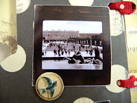
I altered a blank mdf album into a keepsake of my many visits to Paris, France.


I covered the blank pages with paper & elements
from Brenda Walton's Maison collection by K & Company.

The pages are approx. 8½ inches tall & 3 inches wide (ignoring the tabs).


I looked through my photographs to choose my favourites
& scanned the selected ones onto my computer.

I then altered most of the coloured photographs to monochrome
& selected a brown tone.

I cropped them to fit into an image of a slide mount
(using an image of a brown weathered mount by Tim Holtz).


Once all the images were completed, I printed them out on A4 photographic paper,
cut each image out & sanded the edges.

Text was typed up on the computer, printed out
& secured under blank slide mounts.


I added a few of Tim's doo-dad words & tied the pages together
using some lovely red & cream polka dot grosgrain ribbon.


My thanks to
Brenda - love those papers
Linda - for the mdf album
Fifi - for the ribbon
Tim - slide mount, words & inspiration from the design of his new book,
A Compendium of Curiosities