Search this blog

31 August 2016

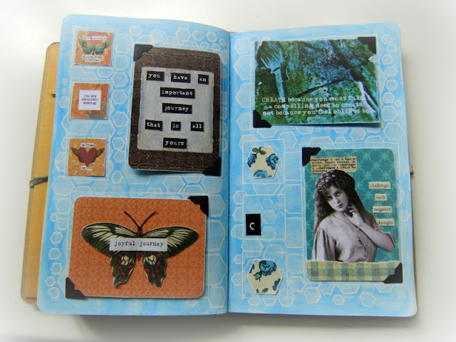
Art Journal Week 34

This is my art journal page for Week 34.


I followed the prompt on Colour Me Positive (CMP), which was Being the Best,
with an additional prompt of superpower.


So if you could have one superpower,
what would it be?


The inchie graphic is from BGU.


The Artist Trading Card was made for The Craft Barn Alpha Challenge.

You can read more about it here.

To create the background
I used Distress Crayons
(twisted citron/mermaid lagoon/peacock feathers)
over a white gesso base.


The grid was drawn with my Dylusions Black Paint Pen.

Here are Week 33 & 34 together.


I forgot to add in my letter for the Alpha Challenge ...


28 August 2016

Keep Hope in your Heart

The Alpha Challenge at The Craft Barn is a year long creative challenge,
using a letter from the alphabet every two weeks as inspiration.

The next letter (as it is not being done in alphabetical order) is
H
& we must include the definition of our chosen word.

I have chosen the word
Hope.


The image of the lady is from The Graphics Fairy.


The definition is torn from an old English dictionary
& the additional words are cut from an old book.


This ATC will have a place in my Art Journal for Week 34.

24 August 2016

Art Journal Week 33

This is my art journal page for week 33.


The prompt this week on Colour Me Positive is Anything is possible.


The two Artist Trading Cards (ATCs) use papers & images from BGU.


They call these Truth Cards.

The inchies this week also use images from BGU.


To create the page background,
I first coated the page in white gesso.


I used Distress Crayons
(twisted citron/mermaid lagoon/peacock feathers)
to draw my grid.

Then Distress Ink (broken china/peeled paint)
through a Tim Holtz stencil (Bubble).

17 August 2016

Art Journal Week 32

This is my Art Journal page for Week 32.


I followed the prompt on Colour Me Positive (CMP), which was Alive.


The Artist Trading Card was made for The Craft Barn Alpha Challenge.


You can read more about it here.


The week number badge is cut out from a Tim Holtz Pocket Card.

All other images are from The Graphics Fairy.


I added the pair of eyes, to make you turn the page 90°,
as sometimes you need to look at things from a different angle.

To create the background I used Americana multi-surface
Neon acrylic paint by DecoArt (pink & blue)
over a base of white gesso.

Once dried I used stencils to add a layer of visual interest,
using more white gesso & a mini blending tool.


I used the Bubble stencil by Tim Holtz,
a handmade stencil derived from his Vintage Market alphabet die by Sizzix
& one of my own, made during ICAD2016.


To draw the grid, I used a White Dylusions Paint Pen.

Here are pages for Week 31 & 32 together.


14 August 2016

Seeking out the Positive

The Alpha Challenge at The Craft Barn is a year long creative challenge,
using a letter from the alphabet every two weeks as inspiration.

The next letter (as it is not being done in alphabetical order) is
Z
& we must include the definition of our chosen word,
together with a pearl.

I have chosen the word
Zoom.


Choosing a word from the Z section of the dictionary is always tough,
even more so when you are trying to follow a theme.


My theme for the year is Resilience.
We should try to focus on the positive,
look for the positive side in each situation &
seek out the positive every day.


The two images are from The Graphics Fairy.

As for the additional challenge,
well I gave her pearl buttons on her cuffs.

This ATC will have a place in my Art Journal for Week 32.

12 August 2016

Making it my own ...

Creative Chemistry 103 was an intensive technique course,
crammed with information, tips, advice, ideas ...


During the first week, Tim Holtz released video tutorials each day,
leaving us some time during the second week to review & play.

Below are my favourite techniques, one from each day,
but before I begin,
you may be wondering about the title of this blog post ...
well apart from one tag,
I had to adjust & adapt the technique to fit the supplies I had,
thus
"Making it my own ...".


Day 1 - Distress Micro Glaze Resist

I used Micro Glaze for the first time to create this background.
I'm intrigued to see what else this glaze will do.

I was suppose to use Distress Spray Stains,
but I don't own any,
so I squished some Distress Ink on my craft sheet
& spritzed with water to make it more fluid.

This was an easy way to create interesting backgrounds
& I can see myself using this method in my art journal.

Distress Micro Glaze Resist Technique
I used the following:-

Manila Tag #8
Tim Holtz Stencil - Dot Fade
Tim Holtz Stencil - Flourish
Tim Holtz Stencil - Bubble
Tim Holtz Stencil - Typo
Distress Stain - picket fence (decantered into a Mini Mister)
Distress Ink - broken china
Distress Ink - weathered wood
Distress Ink - mustard seed
Distress Ink - picket fence

Day 2 - Paint Lifting 

We were suppose to use Distress Paints for this technique,
but I don't own any.

I usually use kitchen towel to lift paint,
which gives me more control over the result.

The wet wipe that I used was far too wet,
which lead to some crinkling when I lifted the stencil off,
so although this was unintentional,
it added another level of interest.

Paint Lifting Technique
I used the following:-

Manila Tag #8
Tim Holtz Stencil - Flourish
Tim Holtz Stencil - Bubble
Tim Holtz Stencil - Typo
Own Stencils (Vintage Market/Pebbles)
Distress Stain - picket fence in a Mini Mister
various acrylic paints

Day 3 - Texture Paste Resist

So what do you do when you don't own any Transparent Gloss Texture Paste?

Try Glossy Accents instead.

I squeezed some Glossy Accents on to my craft sheet
& used a palette knife to spread it over & through the stencil.

Quick rinse under the cold tap with some liquid soap
& the stencil was clean.

I like the texture & shine that this technique gives to the cardstock,
without totally obscuring the detail underneath,
so I will probably use this method again.

Transparent Gloss Texture Paste Resist Technique
I used the following:-

Tim Holtz Patterned Cardstock
(distressables - Circus)
Glossy Accents
Tim Holtz Stencil - Flourish
Distress Ink - picket fence

Day 4 - Distress Crayon Gesso Fresco 

I adore Faber-Castell Gelatos,
but now I also love Distress Crayons.

They were easy to blend on the white gesso base,
but definitely hard to rub over a non-treated surface.

Love the intense pigments.

They are a friendly medium & will definitely be used in my art journal.

Distress Crayons Gesso Fresco Technique
I used the following:-

Manila Tag #8
Distress Crayons - Set 1
(picked raspberry/spiced marmalade/mustard seed/
twisted citron/peacock feathers/mermaid lagoon)
Dylusions Stencil - Honeycombe
Tim Holtz Stencil - Bubble
Tim Holtz Stencil - Typo

Day 5 - Alcohol Ink Splattered Floral

I always find that the vibrant colours of the alcohol inks
seem to fade quite quickly as the ink begins to seep into the substrate,
even on glossy cardstock.

I don't own any Alcohol Yupo paper,
so my work around for this technique was
coating a manila tag with white gesso
& allowing it to dry thoroughly overnight.

Alcohol Ink Splattered Floral Technique
I used the following:-

Manila Tag #8
white gesso
Alcohol Inks
Blending Solution

As this was my last tag,
I spent more time on it than the others,
doodling with my Blending Pen.

It was fun, but alcohol inks are not for me.

Summary

I enjoyed Creative Chemistry 103 as much as the others,
but as with the rest of Summer of Creative Chemistry,
what I enjoyed most were the live chats.

A lot of the techniques Tim used incorporated stencils
& although I have starting making my own,
I got bored quickly using the few professional ones that I own.

I may have to invest in some of Tim's Mini Stencil sets,
to add interest & variety to my art,
as they can be used in so many different ways ...
see I'm justifying my future expenditure already!

10 August 2016

Art Journal Week 31

This is my art journal page for week 31.


We started a new month on Monday


I used the prompt on Colour Me Positive, which was Sparkle.


I laughed as I immediately thought of Frankie Grande.
He entered the UK Celebrity Big Brother house,
with one side of his head covered in sparkly glitter,
with a catchphrase of "shine bright like a Frankie".


Perhaps we should all try to be a little more positive about ourselves!

I used a quote from a BGU graphic for my Truth Card.


The background paper is by Papermania,
(bought over 7 years ago).

The butterflies are from a graphics CD by Crafty Computer Paper (now Homecrafts).

To create the background I used Americana multi-surface
Neon acrylic paint by DecoArt (pink & blue)
over a base of white gesso.

Once dried I used stencils to add a layer of visual interest,
using more white gesso & a mini blending tool.


I used the Bubble stencil by Tim Holtz,
a handmade stencil derived from his Vintage Market alphabet die by Sizzix
& one of my own, made during ICAD2016.

To draw the grid, I used a black Dylusions Paint Pen.

I love that fact that although this pen has a fine nib, it's not ink, but paint.

It glided over the acrylic paint & gesso stencilling with ease
& was dry in a matter of seconds.
Fabulous!

04 August 2016

Sit Back, Relax & Turn Up The Volume

As mentioned last week,
I have complied a short video of my collection of Index Cards
made during June & July,
for the Index Card a Day Creative Challenge.

Hope you enjoy looking through them.


Did you enjoy the music too?


03 August 2016

Art Journal Week 30

This is my art journal page for Week 30.


I followed the prompt on Colour Me Positive (CMP), which was Creativity.

Creative Wisdom
This was my Creative Wisdom quote from the Royal Academy of Art project last year.

"As an organisation led by living artists,
we've been collecting their "rules" for making art,
and sharing them to encourage creativity."


The Artist Trading Card was made for The Craft Barn Alpha Challenge.

You can read more about it here.


To create the background, I coated the page in white gesso,
then added a layer of Americana multi-surface
Neon acrylic paint by DecoArt (blue).

Once dried, I applied more white gesso
through a Dylusions stencil (Honeycomb Small),
using a Tim Holtz Mini Blending Tool.

I drew the grid with my Uni-ball Signo white pigment ink pen,
then used it to outline some of the hexagon shapes.

The patterned paper used for the two hexagons was from BGU.


Here are weeks 29 & 30 side by side.

01 August 2016

Creative Chemistry 103 with Tim Holtz


The third online class with Tim Holtz starts today.

Make sure you have signed up.