I cut the text page up so it would fit nicely on the page, but the portrait was just the wrong size. To remedy this, I scanned the original, then reduced in size before printing out a copy on white card. I tore the edges to give it a white border.

So to the background pages. I wanted to match the colouring of the original watercolour project. The base pages had already been coated with gesso & a wash of blue paint. To this I added Eco Green Crafts paints (Orchid, Rose & White) & a little purple acrylic paint.

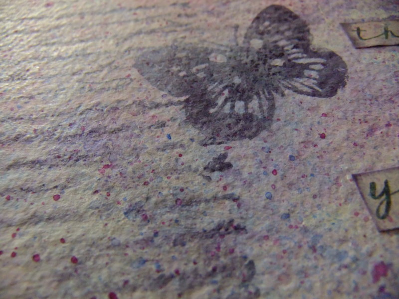
I stamped the butterfly image from Eco Green Crafts Garden Chic recycled rubber art stamp set, using Distress Ink (dusty concord) & also splashed a little diluted ink over the surfaces.

To tone the colours down & to give a more dreamy effect, I used oil pastels (Pale Blue, Pale Orange & White), blending with my fingers. Perfect!

I printed out letters to spell the word strength & added Glossy Accents to the butterfly.

I printed out two butterflies (original image from Dover, with the colour altered to match the project). I muted the printed colour using the white oil pastel. I used one butterfly as the page tab.

To finish, I added three old buttons.

I love the mixture of textures, materials & how they blend together.