Search this blog

29 September 2010

Inchy by Inch Challenges

These inchies are for the inchie challenge blog Inchy by Inch. Fiona has given us single word prompts to inspire us.

Week One - Touch


Week Two - Dainty


Week Three - Wave


Week Four - Separation


My inchie bases are mountboard, cut into 1 inch squares. These were covered in the relevant definitions taken from an old dictionary.

The images were stamped on white tissue paper, using Archival Ink (Jet Black). The tissue paper images were then adhered over the dictionary paper, using matte Studio multi-medium.

I added paper flowers, brads, fibre & Glossy Accents as embellishments.

I like creating sets of inchies, so to tie them together, I mounted each inchie, using 3d foam, on to a square of Papermania backing paper & added additional wording to illustrate the thinking behind each inchie.

The images used were mini rubber stamps designed by Tim Holtz.

10 August 2010

Shabby Rosette

This is my version of the Tim Holtz Paper Rosette.


Instead of using the Sizzix Sizzlits Decorative Strip Die, I cut a strip of his Big Rulers paper & cut one edge using a pair of deckle edged scissors.


Using the grid lines printed on the back (Thank you Tim!) I lightly scored each line, then folded them in alternate directions.

I punch out a circle using a Woodware paper punch to create the centre, adhering it to a circle of mountboard to give it structure.


I lightly sanded the edges to add a little shabby distress to the rosette.

It might not be as quick as using his die, but it didn't take too long.

06 August 2010

In the Frame

This week's project was to alter an old frame. This one, probably over ten years old, was a gift from a friend from their trip to Disneyland. Let's just say it was Eeyore & purple ... I think that's enough to give you an idea of what it was like!

It is four inches square with a photograph aperture 2 inch square, so it was perfect to house my Steampunk Twinchie.


I removed the glass & covered the frame, front & back, with papers designed by Brenda Walton from K & Company.

I used one of the hinges from the back to act as a tab to hold the twinchie in it's place.

I printed two copies of the moth (used in the twinchie) to create the dimensional moth, adding wire antenna.


The words are torn from one of the patterned papers with two epoxy stickers from the same kit.


I added a clock face from my hardware stash.


As with most of my projects, I like the reverse to look as good as the front.


And the sides!


I used double-sided tape, Glossy accents & a little Distress Ink (walnut stain).


04 August 2010

Art Journal Text

The crusade this month for the GPP Street Team
is to use printed text to create a background.


I took a loose blank page from my handmade art journal
& covered the white surface with a story torn from a magazine.

The text background was then covered with bold words
cut from two magazine supplements
that came with the Sunday papers.

I used matte multi-medium to both adhere
& coat the project.

The rough edges were trimmed & then lightly sanded.

The background will be used to complete a future crusade.


19 July 2010

Mother Nature

This page layout in my altered book art journal was inspired by found words in the original printed text "Mother Nature".


I have used these pages to record copies of two previous projects, my first Mandala & my Fresh as a Daisy Stampbord twinchie, as well as my remaining inchie project, Earthworks from a couple of years ago.


The background pages were coated in gesso before being coloured with gold & green paints. The two found words were protected from the paint by drawing gum. There are a couple of stamped butterfly images hidden in the background.


I reproduced the word butterflies from my mandala project & punched three butterflies from a green skeleton leaf using a Woodware paper punch.


I added three small glass Glintz domes to add further texture.


One was placed in the centre of the Stampbord flower image.


For the other two, I used small images from an Eco Green Crafts collage sheet.


I spritzed a fine mist of water over the project, using a Mini Mister, before sweeping a brush of Perfect Pearls (Heirloom Gold & Green Patina), which highlights the background texture.


To finish, I rubbed a little gold Stickles around the page corners & inserted the top of the skeleton leaf to act as the page tab.

17 July 2010

Embracing Imperfection

More pages from my altered book art journal, using an old collection of inchies.


Layers were built up from clear gesso, various blues, silver & black paints, Distress Stickles (Broken China) & a little doodling with my black Sharpie pen.


I stamped the text image "embrace imperfection" & the coffee mug stains with Archival Ink (Jet Black). The mini images are both by Tim Holtz.


The inchies were roughed up a little by sanding around the edges. The original inchies can be seen here.


Some of the original printed words still show through as they were protected from the initial paint layers by using drawing gum.


16 July 2010

A Little Inspiration

Captivating, creative & totally inspiring.


15 July 2010

All cut up

I took a piece of 3x3 inch square mountboard & rounded the corners.

I drew a border & string figure with a pencil, then used a Sharpie pen to go over the pencil drawn string.


On the back, I drew a grid to divide it into 9 squares, numbered them from 1 to 9, then cut them up.


I took each piece to work on individually, rubbing out the pencil lines once each piece was finished.


The pieces were put back together.

In Zentangle speak, this is called an ensemble.

12 July 2010

Z is for Zip

This is my inchie for letter Z of the Inchy by Inch Alphabet challenge.


The image is from Art Creations Friday & the words are torn from an old English Dictionary.


The image was printed on white card & adhered to a mountboard base. The edges were sanded. The dictionary words were inked with Distress Ink (antique linen) & then added to the inchie.

To see a slideshow of this set, please click here.

Here they are all together ...


08 July 2010

Sharpie Zs

Strange how things come back around.

I purchased a couple of black fine point Sharpie pens in the supermarket this week ... just because ... didn't need a reason.

Then something else happened which prompted me to create Zentangles again.

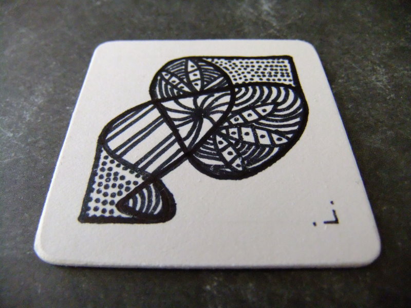
For the first one, I followed the strict rules, bar one. The size of my z tile should be 3½ inches square, but I made mine 2 inch square, commonly known as a Twinchie. My tile is made from white mountboard.


I draw the grid & string image lightly with a pencil, then picked up my Sharpie to play.


I rounded the corners (as instructed) using a previous unused pair of nail clippers to snip off the sharp edges & smoothed them with my craft emery board.

The process of rounding off the corners & the fact that I was using a permanent ink pen, draw me into picking up a domino & away I went ...


I really need a ultra fine point to work on small pieces like this ... I need to find my stash of blank drinks coasters ... now where did I put them?

Zs are perfect for holiday crafting, as all you need to take with you are some blank tiles, a pencil, eraser (to rub away the grid lines) & a pen.