Search this blog

Showing posts with label Wanderlust2017. Show all posts

03 July 2018

The Power of Laughter

This is my One Word card for July
& is the last in this series.

My word for the month is
Laugh.


This project used old scraps of paper
that would have normally been thrown away.

I also used
hand stamped letters with Ranger Archival Ink (Jet Black)
on Dina Wakley Media Tape &
word definition patterned paper.

Throughout this month,
take a moment each day
to laugh.

Share your laughter with others
& rejoice together.


My previous One Word cards

01 June 2018

How delightful

This is my One Word card for June.

My chosen word is
Delight.


This project uses old scraps of paper
that would have normally been thrown away.

I also found this lady,
who has been sitting in my paper scraps box for
10 years.

She was originally printed off for this project.

I also used
hand stamped letters with Ranger Archival Ink (Jet Black)
on Dina Wakley Media Tape &
word definition patterned paper.

Throughout June I am going to make a concerted effort to find
& record moments of delight from each day.

My previous One Word project cards

01 May 2018

Cherish those you love

This is my One Word card for May.

My chosen word is
Cherish.

My father celebrates his 80 birthday this month,
so my focus for the next few weeks
is to remind myself daily of those I cherish
& find new ways to show them
how much they mean to me.


This project uses scraps of paper
for the background,
hand stamped letters with Ranger Archival Ink (Jet Black)
on Dina Wakley Media Tape,
word definition patterned paper,
a Tim Holtz Paper Doll &
Glossy Accents on the heart.

My previous One Word cards

01 April 2018

Going on an Expotition

This is my One Word card for April.

My word is
Explore.

As for the rabbit, well today is Easter Sunday
& they seem to be appearing everywhere!


The original aim of this monthly project
was to use up all those little bits & pieces,
scraps that might otherwise have been thrown away.

This rabbit has been sitting in my little piles of scraps since March 2009,
that's over nine years!

He was originally printed out to use on a specific project,
(see below)
but was actually too large for my Moo,
so I had to print off & use a smaller version.

You can see the original project here.

Moo 2009

So why did I choose Explore?

I am a curious person.
I love to explore,
be it my thoughts, creative ideas or new places.

I worked for a while in Pooh Country,
home of the Winnie the Pooh stories.

It is a beautiful place to explore,
where nature is all around,
where your imagination can run free.

There is nothing finer than a walk through the forest,
& you never know what adventures you may find.

The piece below is taken from a photograph taken on one such walk,
(see here).

I must do more exploring this month.

Digitally Altered Photograph with Haiku 2011

My previous One Word cards

01 March 2018

'Tis the Season to Grow

This is my One Word card for March.

My word is
Grow.


March sees bright flowers bursting into colour,
from those tempting green shoots of February.

Crocus flowers
take over where the Snowdrops have been.

Bright sunshine yellow Daffoldils
gently nod their heads in the cool Spring breeze.

The Lilac buds grow even plumper &
little green buds appear on the Silver Birch branches,
soon to unfurl into glossy green leaves.

With March comes hope,
it marks the start of Spring
with all the promises of new life appearing
from the sleepy depths of Winter.

As we awake from the still quiet rest of Winter,
this is a month to grow ourselves,
to continue to become all we hope to be.

My previous One Word cards

01 February 2018

A Small Word with a Big Impact

This is my One Word card for February,
continuing with a project which began
in a 2017 Wanderlust class, with Kasia Avery.

My chosen word is
Love.


An obvious choice for the month
when we celebrate our loved ones
on Valentine Day,
but love extends to all those we have contact
& connections with, including ourselves.

Sometimes, the hardest person to love is ourselves,
we are more critical than of our friends,
& less forgiving than to our enemies.

This month, let's treat ourselves with love,
with the respect we give so freely to others
& maybe, just maybe, that will make all the difference.


My previous One Word cards

01 January 2018

Pause for Thought

This is my One Word card for January.


My word is
Thought.

A new year,
a fresh beginning,
a clean slate,
which means it is time to pause for thought.

Whether you have drawn up New Years Resolutions,
made plans for the year ahead,
this month we all seem to find ourselves in both a reflective,
yet forward looking mood.

The passage from Pride & Prejudice
on which this contemplative lad stands, says
"with thoughts that could rest on nothing".

If you are struggling this month to make a decision,
try a simple exercise in free writing
to see if that helps bring clarity to your thoughts.

Writing down our thoughts, without censure,
is a great way to understanding what our subconscious is trying to tell us.

The image used is a Paper Doll from Tim Holtz.

My previous One Word cards

01 December 2017

Joy to the World

This is my One Word card for December.


My word is
Joy.

My definition of Joy is the physical expression of delight,
an outward display of being glad.

In these current times, we sometimes forget to show happiness,
we almost feel embarrassed to exhibit such seemingly decadent emotions,
but it is so important for us to reinforce these feelings.

So this month, let us be joyous.


The One Word project was an idea by Kasia Avery,
during Week 33 of her Wanderlust 2017 online class.

Each month we choose our word for that month
& make a small card which goes into our One Word box.

The project is mainly about using up old scraps of paper
or recycling junk mail,
things that other people would consider to be trash.

I went for using up all those small scraps of paper
 that I have been hoarding over the years,
some pieces so small that most people
would have already discarded them.

I enjoy the process of paper collage,
combining different patterns & images together
to create a cohesive piece of art.

These two little girls are
Paper Dolls from Tim Holtz.

My previous One Word cards

01 November 2017

Believe

This is my One Word card for November.


My word is
Believe.

It is important to believe in yourself,
your ability & your own creative ideas.


The One Word project was an idea by Kasia Avery,
during Week 33 of her Wanderlust 2017 online class.

Each month we choose our word for that month
& make a small card which goes into our One Word box.

The project is mainly about using up old scraps of paper
or recycling junk mail,
things that other people would consider to be trash.

I went for using up all those small scraps of paper
 that I have been hoarding over the years,
some pieces so small that most people
would have already discarded them.

I enjoy the process of paper collage,
combining different patterns & images together
to create a cohesive piece of art.

My previous One Word cards

31 October 2017

Wanderlust Mixed Media Art Journal Lesson

The Wanderlust class a few weeks ago
was with Marta Lapkowska.

We created a mixed media art journal page.
Marta used an old book for her lesson,
but I used a booklet that was recently put through my letterbox.


I tried to follow along with Marta,
being brave & copying her style.


It felt uncomfortable.


Not my normal style or method of working.


There is a long list of materials,
so I hope I have remembered everything.

Liquitex Clear Gesso
Golden White Gesso
Ranger Texture Paste
Dina Wakley Media Stencil (Cellular)
Matte Mod Podge

Tim Holtz Distress Inks
aged mahogany
antique linen
black soot
brushed corduroy
mustard seed
walnut stain

Lindy's Stamp Gang Moon Shadow Mist (Buccaneer Bronze)

Old pieces of lace, fabric & organza ribbon
wooden butterfly shapes
a white paper flower
white cotton thread
abaca ribbon
& white string

Ranger Liquid Pearls (White Opal)
Tim Holtz Distress Crayons

The butterfly image (from a collage sheet by Everything Art)
is one I had already printed off.
It is covered with Ranger's Glossy Accents.


I am not that happy with the final result,
but I enjoyed the process
& watching Marta's video lesson.

04 October 2017

Looking for Inspiration

This is my One Word card for October.

My word is
Inspire.

It is important to continually look for inspiration,
to see the possible from the ordinary,
the beauty in the unusual
& translate this into our own creativity.


The One Word project was an idea by Kasia Avery,
during Week 33 of her Wanderlust 2017 online class.

Each month we choose our word for that month
& make a small card which goes into our One Word box,
which last month had a slight make-over.


The project is mainly about using up old scraps of paper
or recycling junk mail,
things that other people would consider to be trash.

I went for using up all those small scraps of paper
 that I have been hoarding over the years,
some pieces so small that most people
would have already discarded them.

I enjoy the process of paper collage,
combining different patterns & images together
to create a cohesive piece of art.

My previous One Word cards

03 September 2017

Time for Change

The Wanderlust online class for Week 33,
led by Kasia Avery,
was to create a One Word project.

Each month we choose a word for that month
& make a small card which goes in our One Word box.

This is my One Word card for September.


September is all about change,
especially as the season is starting to move from Summer into Autumn,
the leaves on the trees are already turning colour & falling ...

I used old scraps of paper,
so small that most people would have already discarded them.

I wanted to use the piece with the pink flower,
(to match the red of the postage stamp image)
then I realised that the edges of the envelope image
would line up with the definition paper,
so I made a pocket for my change ...

See what I did there?

My previous One Words

23 August 2017

Just One Word


Week 33 on the Wanderlust online course
 & Kasia Avery was encouraging us to reuse old boxes & paper,
to create a One Word Box project.

Each month we choose a word for that month
& make a small card which goes in the box.

Simple.

The box I used for my project was
an empty extra long match box.


I coated the outside with white gesso.
It took several coats to cover up the graphics.

While this was drying,
I cut my monthly cards, using offcuts of some resist motif
12x12 inch cardstock by Tim Holtz.


To fit inside my box & to leave room around the edges,
mine were 5.5 cm wide & 8.5 cm in length.
They are about the size of a gift card.

I rounded off the corners
& punched a small hole in the top of each one.

I made my card for the month,
again using little scraps of leftover papers
& stamped my word "begin".


I have begun to work on the top of the box,
using a tag that I found on my desk,
some loose cotton threads,
buttons & some Art Glitter Fantasy Fiber
(which I had forgotten that I had until Jamie's lesson from the same week).


The three hearts were from the air dry clay lesson from week 25
& were still sitting on my desk.

So I have begun
& that's always the most important place to start,
don't you think?

30 July 2017

A Mood or Two

For the art lesson of Week 29 on the Wanderlust online course,
Kasia Avery was inspiring us to make mood boards.

Everyday we are bombarded with images,
more now than ever, with smartphones & tablets on the go,
computers & televisions at work & at home.

Mood boards are a way to slow down & actually look at printed imagery
distilling those which speak to us personally in some way,
whether it be the colours or patterns that excite us
or the memories they evoke.

Whether you then use them to inspire further work
or just to capture your feelings at a certain moment in time,
creating them enables you to shut out the noise from the rest of the world
& tune in to yourself,
an act of meditation,
of listening to yourself
& learning what is important to you.

Below are a couple that I made during the week.


The first has a palette of cool blues & greens
with a highlight of yellow.

Round & oval shapes.

"The Simple Things"

It evokes a feeling of home comforts,
my morning coffee,
the smell of home baking,
the greenery & flowers of the garden.

"Stop away from the daily grind
and reset your mind."


The second has a warmer, more energetic palette.

Strong reds & oranges,
hard linear brickwork,
restricting lines & rectangles.

It reminds me that there are new places to explore.

A challenge to be more adventurous maybe.

To be bold.

"Isn't it time you tried something different"

28 June 2017

Playtime

Week 25 on the Wanderlust online course had a technical lesson
by Jamie Avery on using metal,
whilst Kasia's lesson was using air dried clay
to create a tile reinforcing our course values from January.

My three words from January were

play
refine
develop

I picked the shortest to fit onto my tile.


Once kneaded, I used a wooden rolling pin to roll out my clay,
then pressed in some Tim Holtz Grungboard letters to spell my word.

I also used a K & Company key
& some old lace
& an embossing tool to make indents into the soft clay.

Once dried, I added colour.
I used
Tim Holtz Distress Inks (broken china/peeled paint/weathered wood)
Dina Wakley Media Glazing Medium
Ranger Perfect Pearls
Uni-ball Signo Permanent Ink pens (Gold/White)

I think next time I will gesso my piece before adding the colour,
as most of it has absorbed into the clay.

Also my tile was too thin & indents dried too small
to add the other items I really wanted to include,
to make it a truly mixed media piece.

31 May 2017

Larger than Normal

One of the Wanderlust lessons for week 21 was by Kasia Avery.


Her theme was working big -
creating art on a substrate which was larger than we would normally use.

My substrate was a old picture found at a charity shop last week,
which was cheaper than buying a large canvas.


I prepped it by removing as much of the original varnished image as I could,
then added white gesso to the wooden base
& repainted the frame.

The dimensions are approx. 11 x 13 inches,
which is very large for me.

I am restricted by the amount of available surface area on my desk.
I think the largest to date has been 5 x 8 inches.

In the lesson, Kasia was encouraging us to keep to our own style
& just upscale our usual work,
so I began by adding some text & an image from a bird book,
which I also purchased from the charity shop.

The bird is a Great Grey Shrike.


I wanted to add some texture,
which I did with pieces of ribbon.
One was glittery silver,
one was organza ribbon
& the third is a fabric tape.


I used Golden Soft Gel (Matte) to adhere the pieces,
leaving it to then dry thoroughly.

Next came acrylic paints using
Dina Wakley Media in Lemon & Lapis.


I added a layer of the mixed paint to the frame as well.


I added a baseline to anchor the bird & branch
with more torn text & frayed organza ribbons.

Then some paper from 7 Dots Studio
& two other pieces of paper from my scraps folder.


& then a piece of paper covered wire.


Finally I added some shading & highlighting.

I turned my attention back to the frame.
So far it has been cleaned & given two coats of acrylic paint,
first in Mulch by Eco Green, then one in Dina Wakley Media.


The third layer was Eco Green acrylic paint in Pure Silver,
then to distress the layers,
I took it outside to give it a good rub over with wire wool,
then finally I added some Eco Green Black paint.


In Week 17, Kasia asked us to work small,
so I thought I would show you the size difference between the two projects.


18 May 2017

Free from all restraint

The Wanderlust lesson for week 19 was by Kate Crane.

Her theme was patchwork.


The base of my page is watercolour card,
with a thin layer of white gesso.

 In the photograph below, you can see some of the texture I created in the wet gesso.


The word May was cut out from the calendar
I have been using for the Wanderlust course.

Every month I have included the name on one of the pieces made during that month.


Detail was added with doodles
& a hand carved rubber stamp.


I added a variety of washi tapes,
including this numerical piece of handmade washi style tape.


The book text was cut from my copy of Pride & Prejudice.


So why did I choose those particular words?

I usually find that following someone else's direction restricts my creativity.

My pleasure in art, is doing my own thing,
& following my own lead.

I stared at my piece ...
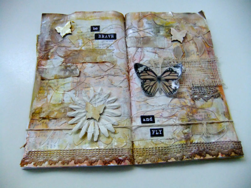
at the butterfly,
examined my feelings
& realised that although the patchwork style is restrictive in it's essence,
what I had created was still identifiable as my own work,
therefore I had allowed my own style to show through,
so I had been free to express myself.

It was just a different kind of freedom.


So what did I learn from this week's lesson?

I have learnt that using soft sable paint brushes
to try to control acrylic paint
 is not such a good idea.
I think the moment has arrived for me to invest in more suitable brushes.

That it is good, at times, to force yourself to experiment
with different styles & techniques.

I actually prefer the background on my mop up page (shown below),
which I created using the paint leftover on my craft sheet.

Learning what you don't like
is as important as understanding what you do like.


I also used acrylic paint (Waterfall/Tide Pool/Pistachio/Black)
Distress Crayon (twisted citron)
Gelatos (Pistachio & Snow Cone)
Distress Marker (black soot)
dylusions paint pen (black marble)
Uniball Signo pigment ink pen (Silver)

12 May 2017

Adventure Journal: Video Flip Through

Thought I would do a short video flip through of my Adventure Collage Journal,
made for Week 17 of the 2017 Wanderlust online course,
inspired by the lesson with Kasia Avery of Everything Art


Hope you enjoy watching.

11 May 2017

Adventure Journal: Treasure & Reflection

The last two pages of my mini paper collage journal made for week 17
of the online Wanderlust class with Everything Art.

The pages are 3x4 inches in size,
made using just one 12x12 inch sheet of kraft resist paper by Tim Holtz.


Detailing was made with a Stabilo All black pencil.


The edges have been distressed with Tim's Paper Distresser by Tonic Studios
& coloured with Distress Ink (walnut stain).